
App UI/UX
Colours
Main pages
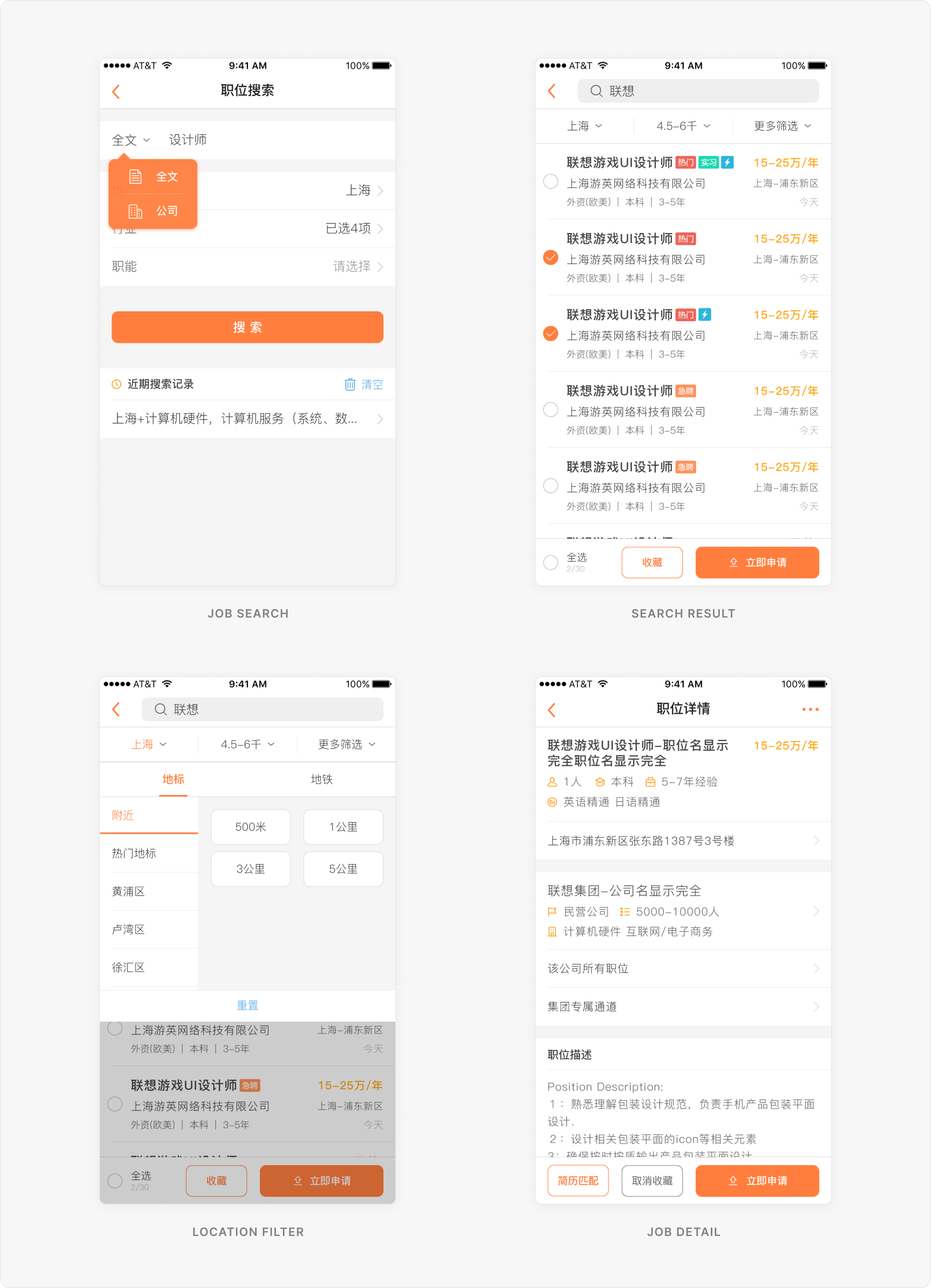
Job search and job detail
When designing information-heavy pages, it’s important to have a clear hierarchy. I make sure the information users care about most is shown first, like salary, job location, and basic requirements. This helps users quickly decide if a job is right for them, saving time and improving the match between users and jobs. In the end, it benefits recruiters as well.
What people care about
- Am I qualified for this job?→ Show the experience and education requirements clearly.
- How much will I be paid?→ Show the salary upfront.
- Is this job far from home?→ Make location filters flexible. Users can filter by distance or even by their preferred subway line.
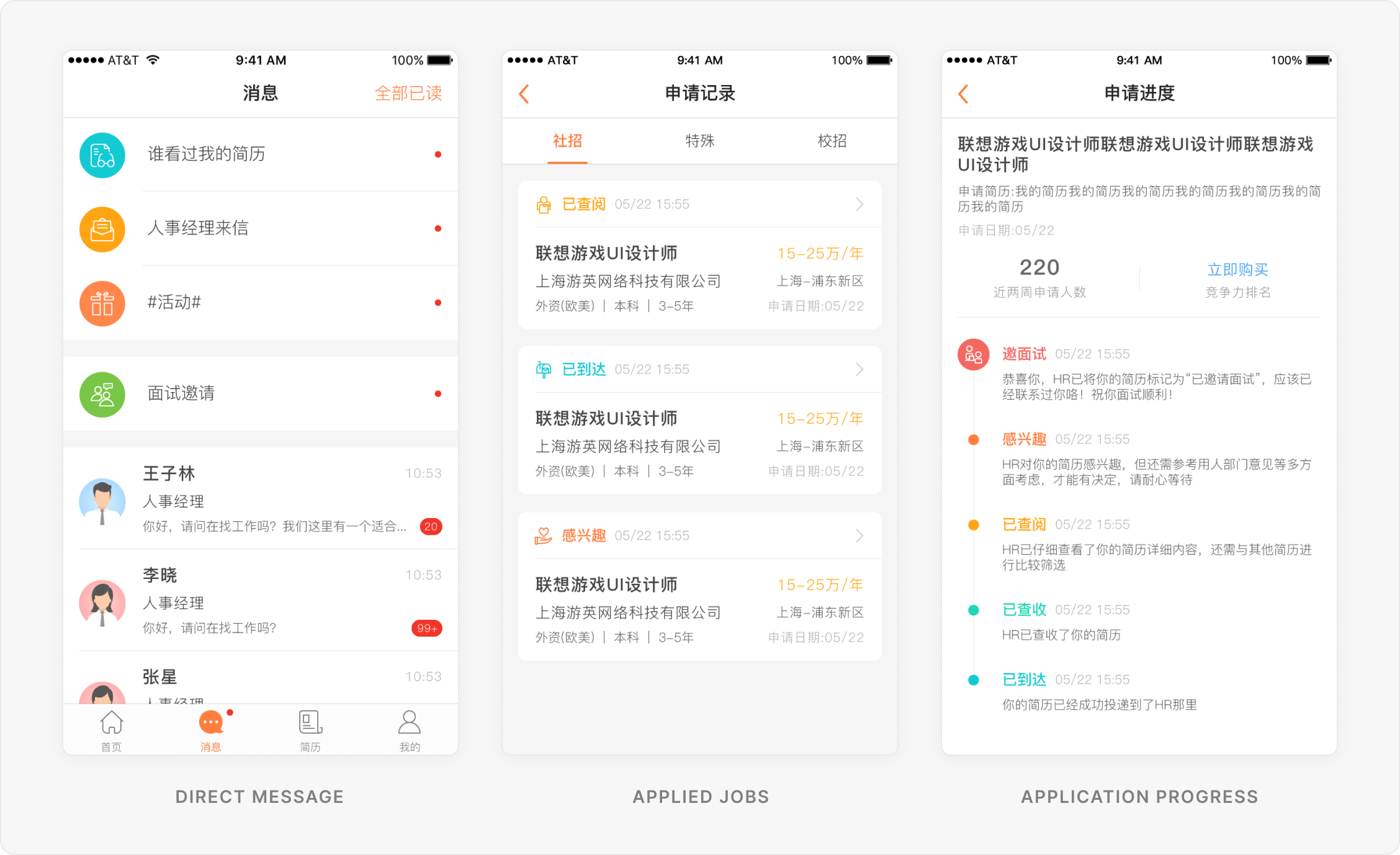
Bring clarity to the application process
Users can communicate directly with recruiters and track their application progress, making the job search process more transparent and less stressful.
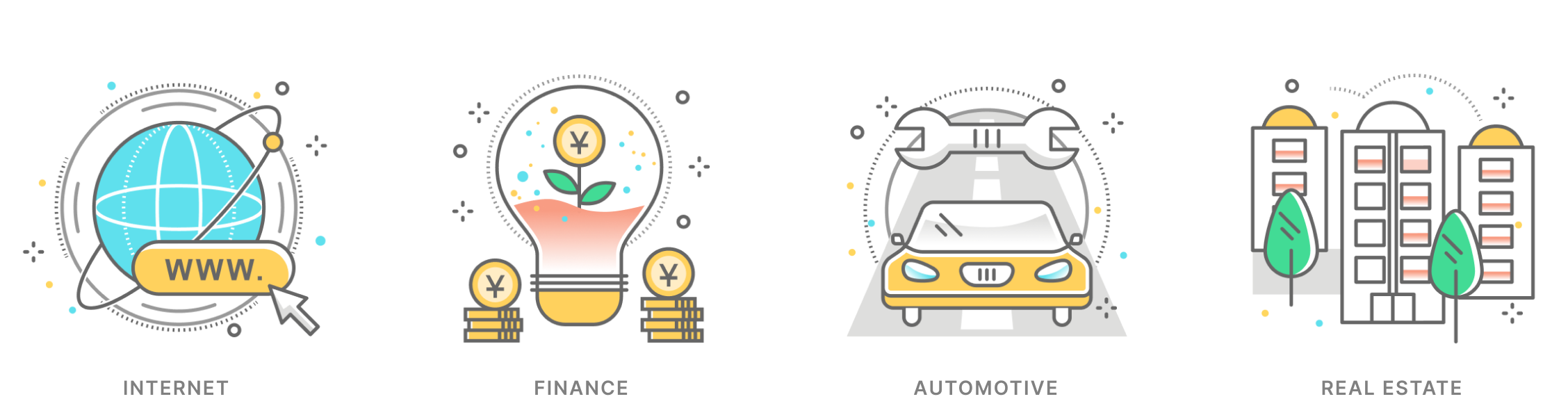
More icon design
Product Operations
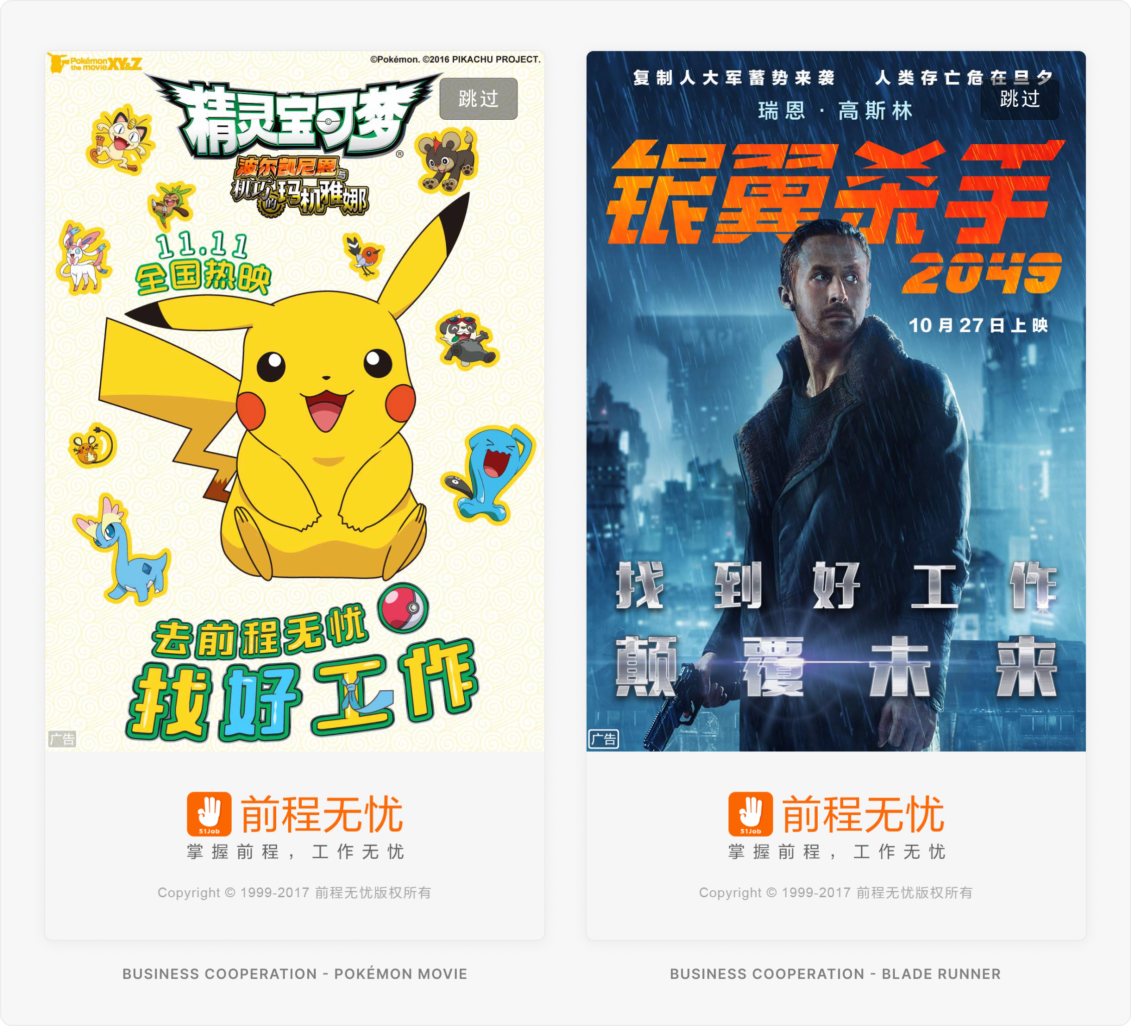
Launch advertisements
I designed some launch screen ads and defined requirements for both images and videos, making sure they display properly across different screen sizes.
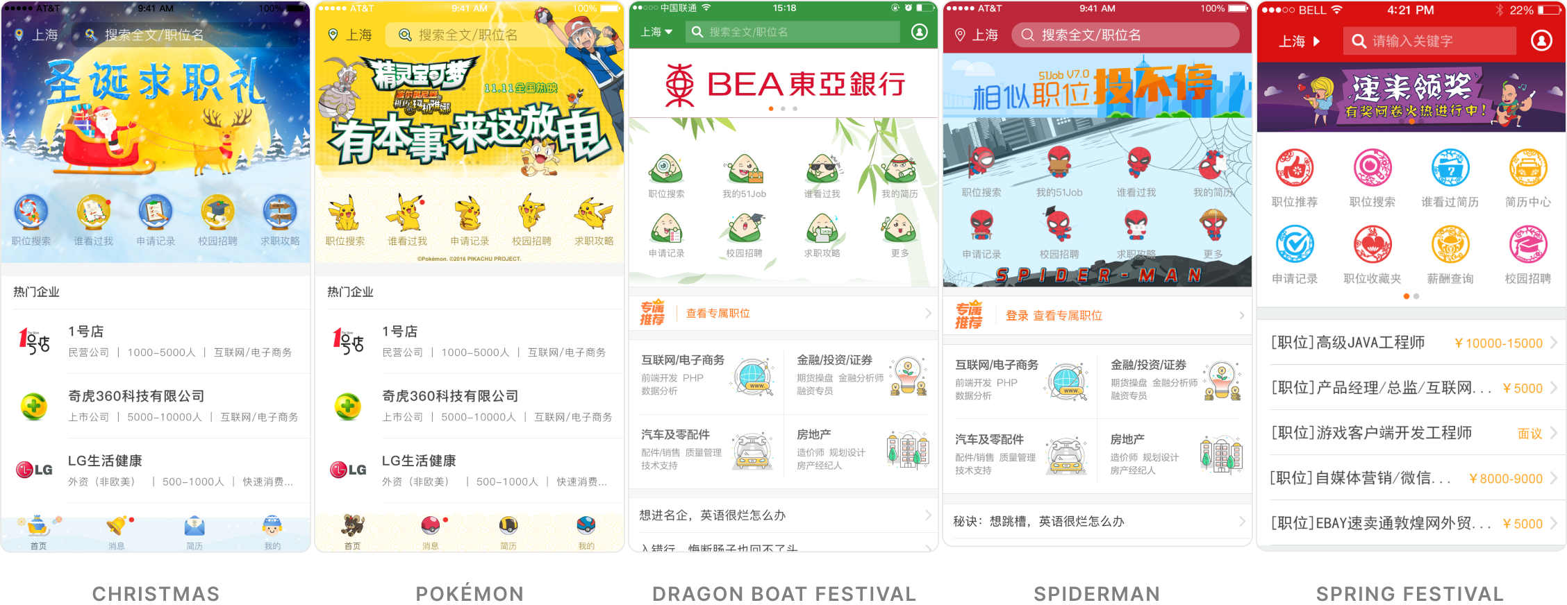
Themed homepage
For holidays or marketing campaigns, the homepage can switch to a custom theme. I worked with developers to make these assets updateable through the backend, so we didn’t need to release a new app version for every theme change.
HTML campaign pages
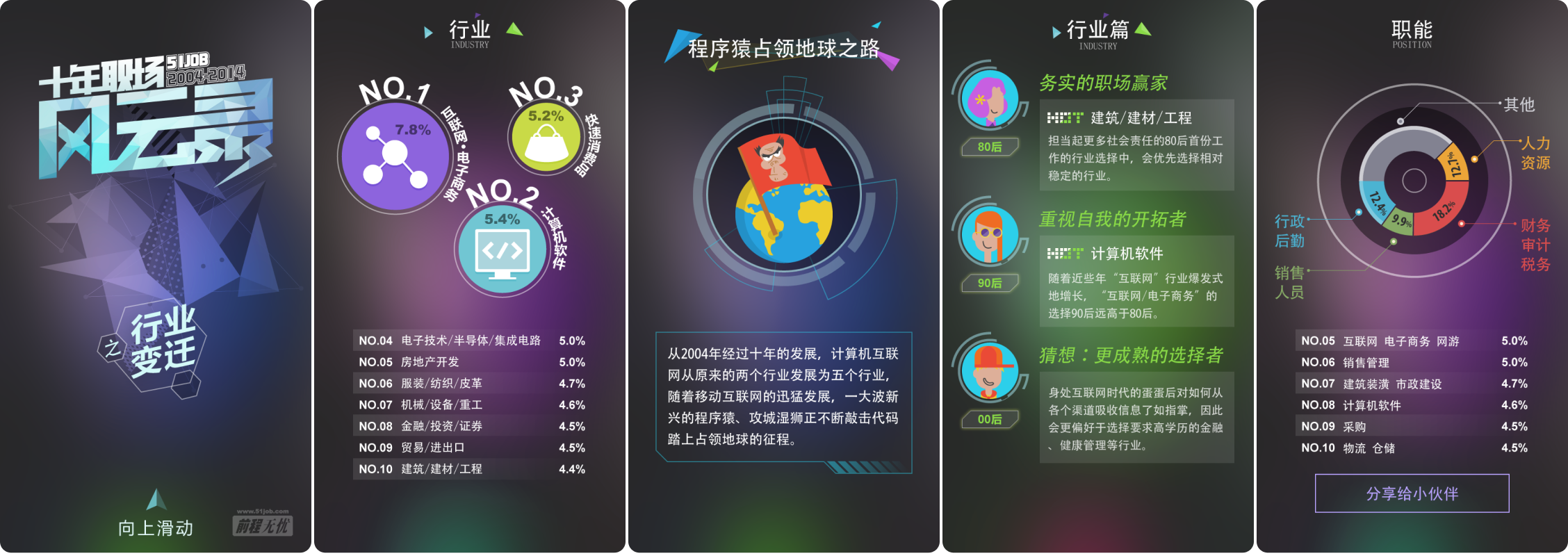
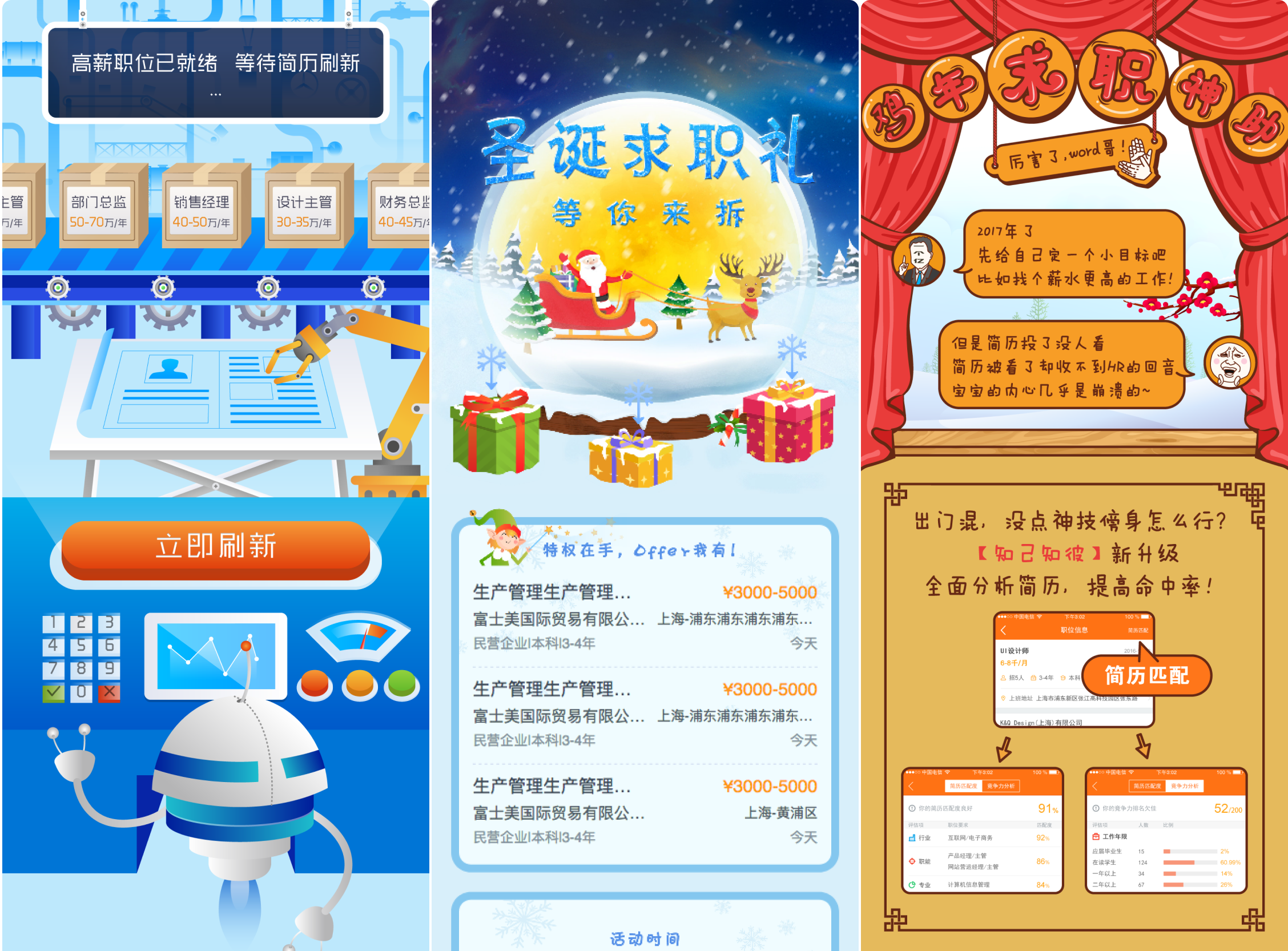
I worked with the product operations team to design HTML-based campaign pages that could be used across our apps, website, and external marketing channels. Users could join activities to win rewards or read industry reports to learn more about the job market. These pages helped keep the platform active and engaging, strengthen the brand, and attract new users to register. For existing users, they also helped build trust and gave them more reasons to stay with the platform.
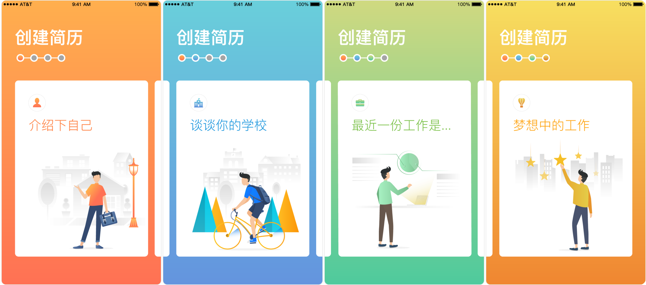
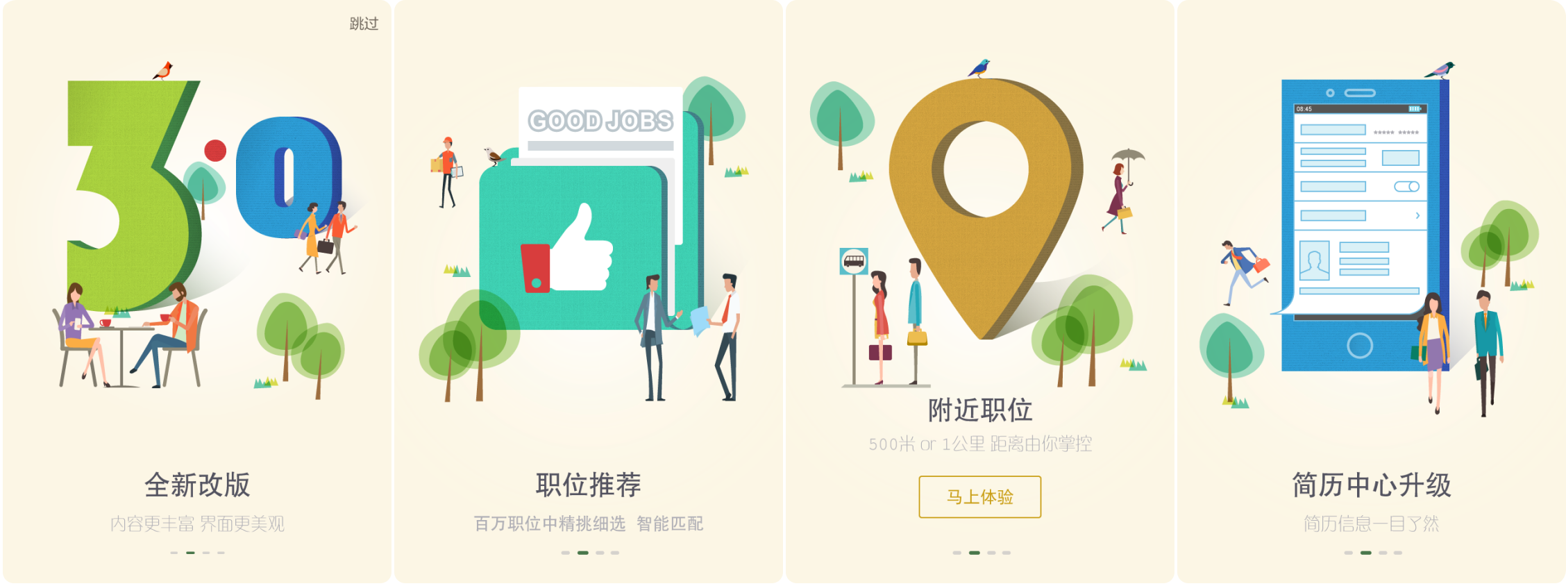
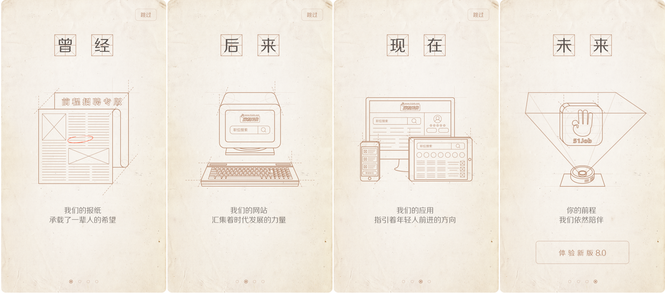
New version introduction screens
I see new version introduction screens as part of the product’s branding. They show users that the product is actively improving and that there is a team behind it that cares about the product and its users.
So instead of simply explaining what’s new, I prefer a softer and more emotional approach. I use visuals that relate to users’ everyday lives, such as graduating from school or waiting for the bus to work. These small moments help the product feel closer to users and create a warmer, more human brand image.