
01
Threshold Settings
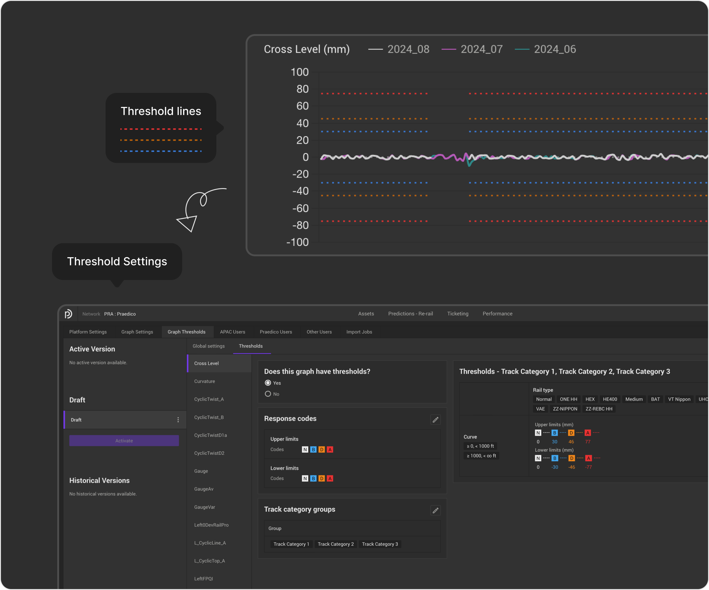
Threshold Settings define the acceptable measurement ranges for different asset types, enabling the system to identify defects and determine their severity.
- Who
- Thresholds are configured by the relevant asset manager, with each discipline maintaining its own set of thresholds (e.g., Track and Overhead Line).
- When
- During the initial network setup, users configure thresholds after importing assets but before importing measurement data.
Design Highlights
Edit response codes
Enable users to quickly add response codes in the correct order, with clear visual cues indicating each code's severity.
Variables Grouping
Simplify grouping with an intuitive drag-and-drop interaction.
02
Map & Table Filters
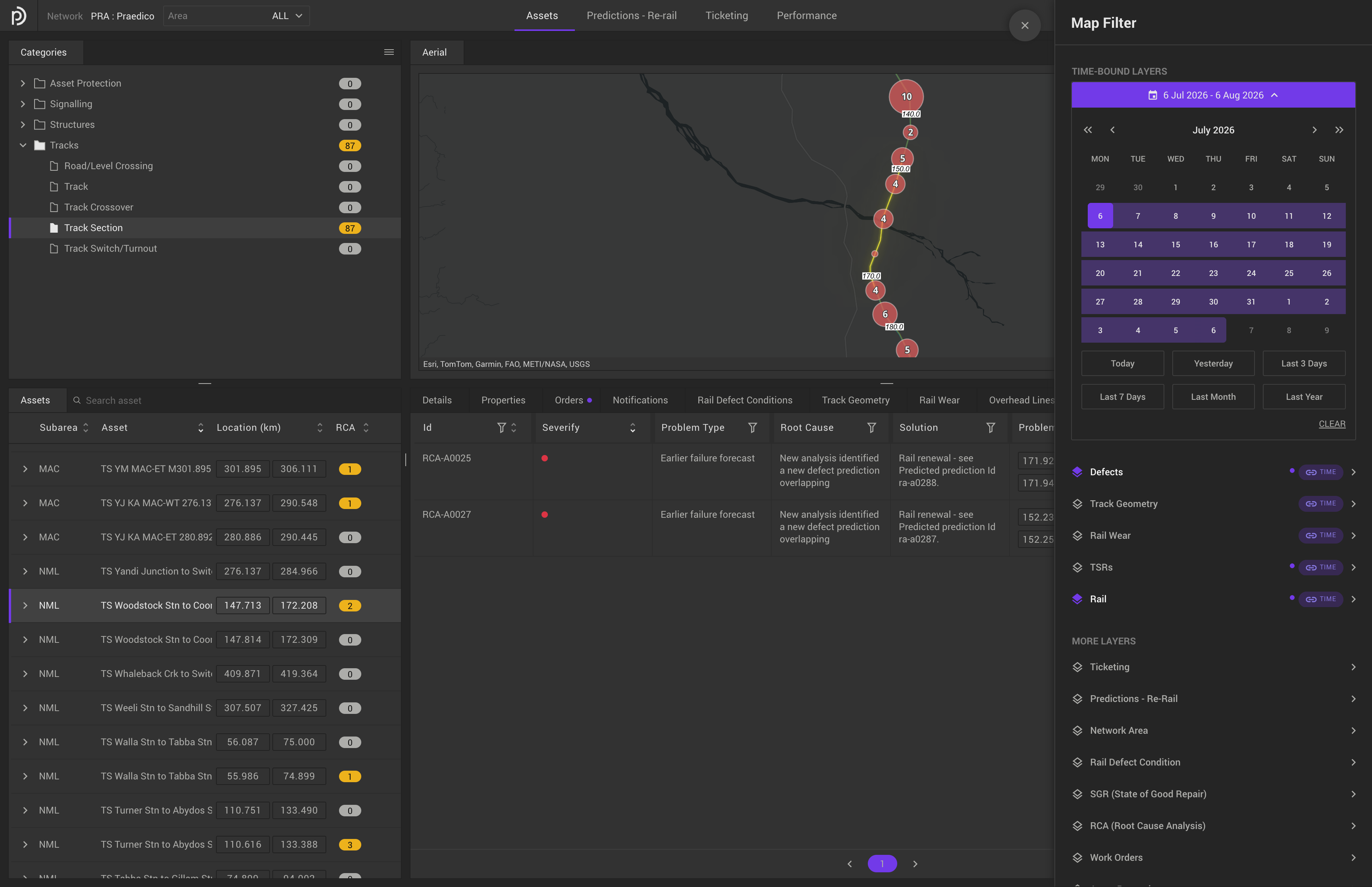
Users can view their data in both table and map views, making it easier to identify where problems occur and understand other contributing factors.
- Problems
Filters were scattered across multiple dropdowns.
The map displays all assets across the network, while the table shows records for the selected asset. Shared filters existed in both the map and table, requiring users to filter twice.
- Challenge
- The table included additional filters that only applied to the selected asset, while some filters were shared with the map. How could we remove duplicate filtering without losing table-specific filters?
Design Highlights
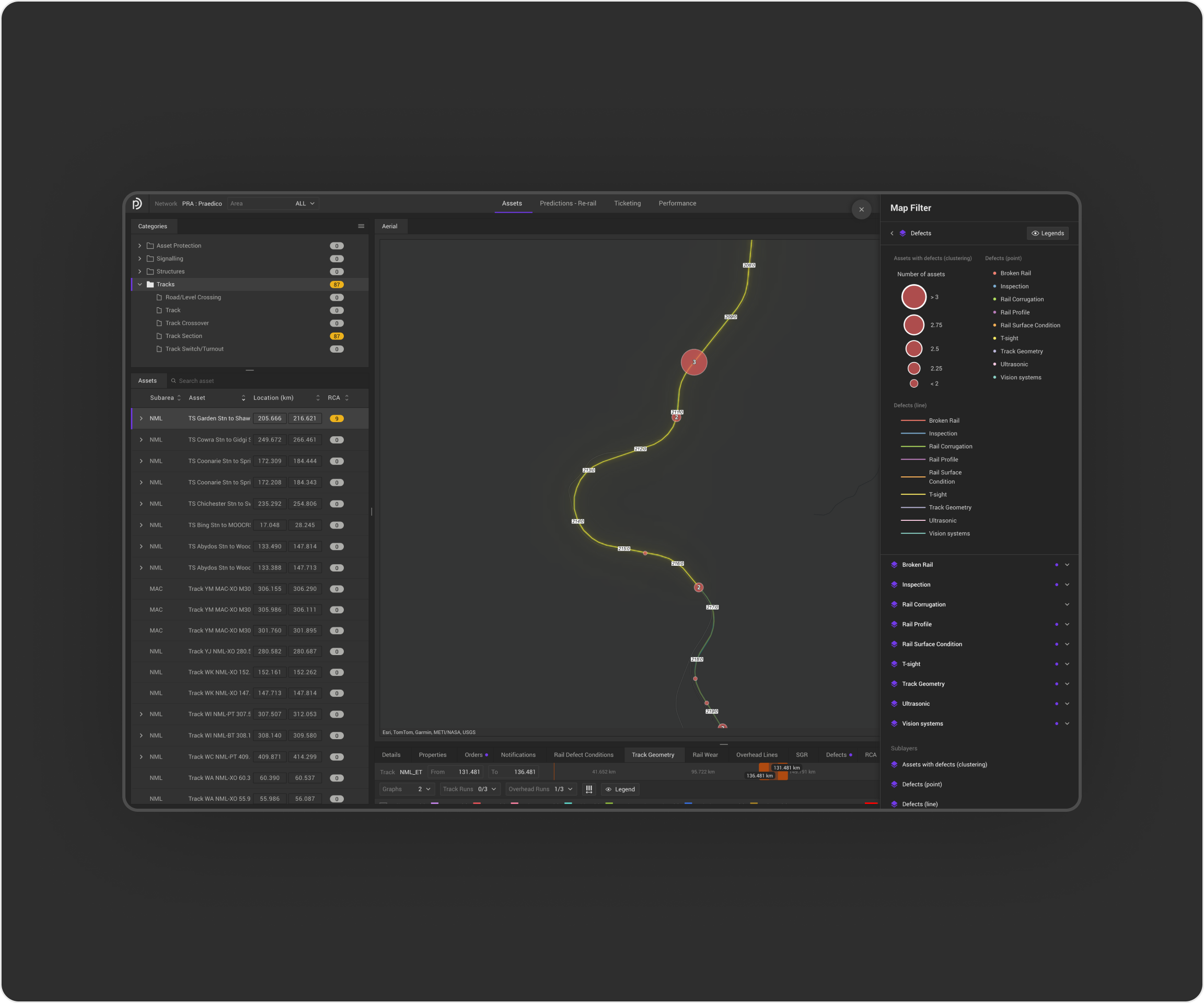
Centralised filtering
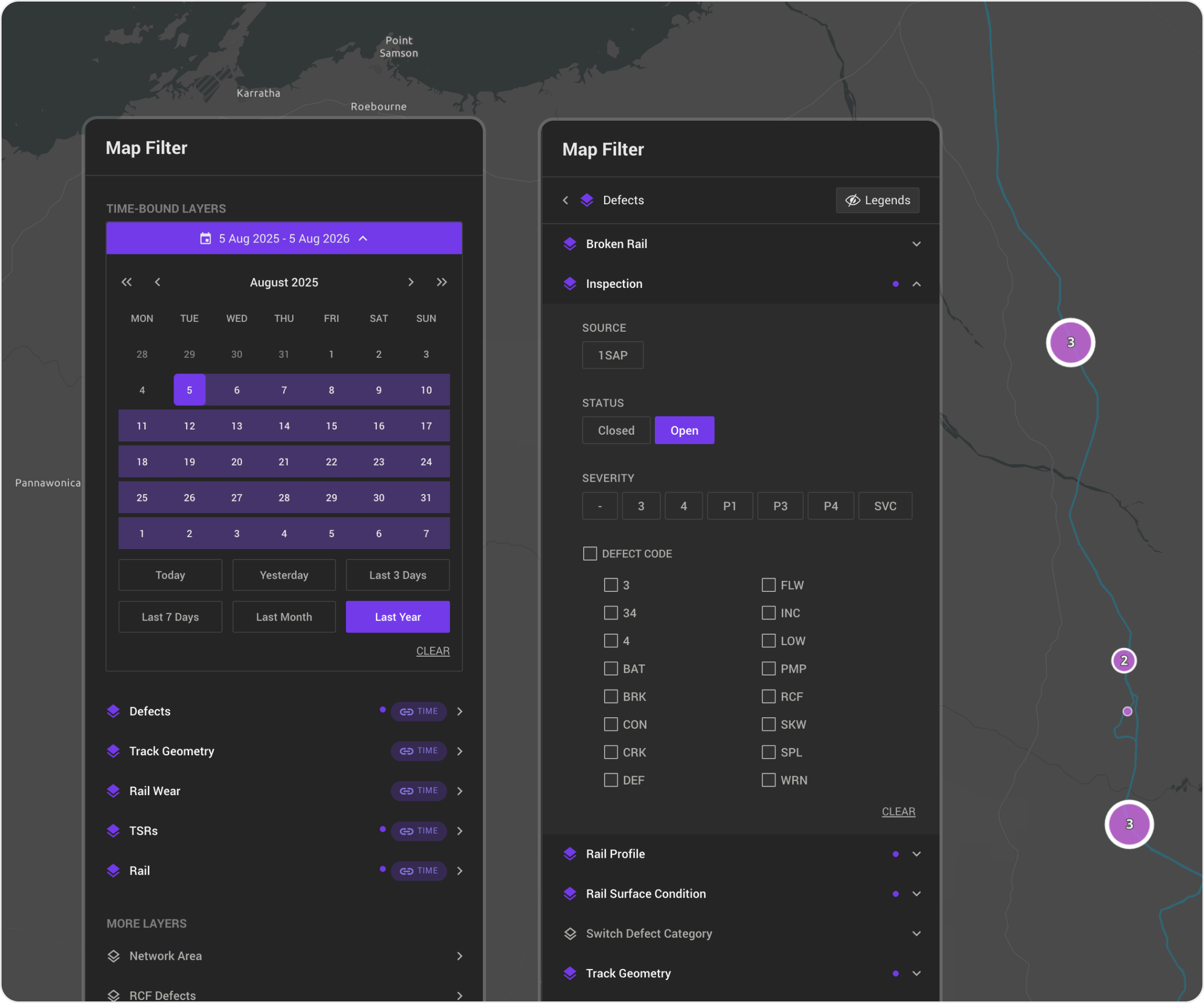
Previously, map filtering was spread across multiple panels, requiring users to switch between different filters. The new design consolidates all filtering options into a single panel on the right, allowing users to adjust filters while viewing the results on the map in real time.
No more duplicate filtering
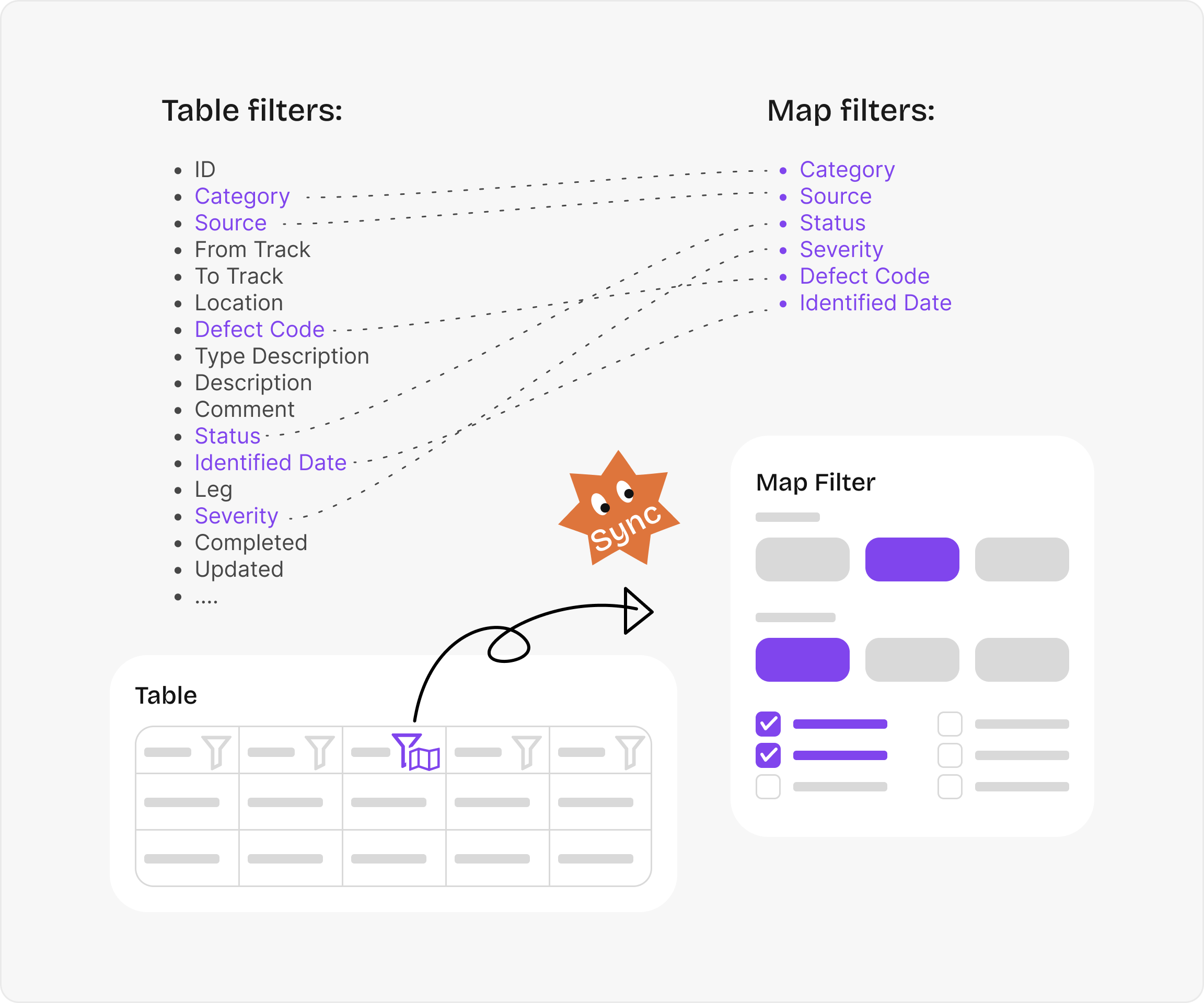
Previously, users had to manage overlapping filters separately in the table and the map. The redesigned experience introduces a synchronised filtering system: selecting a shared filter from the table opens the map filter panel, while any changes made in the map filter are instantly reflected in the table. This creates a single, consistent filtering workflow and eliminates duplicate actions.
03
Graph Design
Some thoughts from designing graphs
Tooltip position matters
On dense charts, tooltips that follow the cursor can become jumpy and distracting. Keeping the tooltip in a fixed position makes the interaction feel much more stable. Also, avoid placing it over important data whenever possible.
Don't make users hunt for data points
People shouldn't need to hover precisely over a tiny point. Let the entire chart area respond to hover, and use a vertical guide line to show exactly where they're looking.
Good comparison starts with aligned data.
Overlaying measurements helps users see how the data changes. Ideally, they can hover over one point and compare all measurements from that location.
But this only works when the data is properly aligned. We first had to decide how much positional difference could still count as the same location. So this wasn't just a chart design problem—the data had to support the interaction too.
Line charts can hide missing data.
While working on line charts, I realised that missing measurements could still be connected by a line, making the data look continuous when it wasn't.
We had to define what should be considered a "missing gap" and break the line accordingly, so users wouldn't mistake missing data for real measurements.